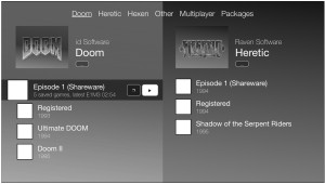
Last week I was sketching my ideas for the Home screen UI. I arrived at a design I’m comfortable enough with to start prototyping using actual Doomsday UI widgets. This will let me try out the design in practice to see if it works as envisioned.
Thus far, the Home UI has been more or less a placeholder. When considering all the features that the Home should offer, a grid of buttons is a bit too simple a choice. In addition to selecting which game to play, the Home will let you load and delete saved games, install and browse add-ons, create and edit custom game profiles with a persistent list of add-ons to use, select add-ons to use for a game session, and browse and join multiplayer games.
There are a couple of key points that the new design takes into account:
- Since there are quite a number of separate games, and the user can create additional profiles, a single list is not ideal. It is better to divide the games by some criteria, like family: Doom, Heretic, Hexen, Other.
- The design should be responsive in that it scales to different monitor sizes. The old grid design looks particularly bad on a large 27″+ monitor, for instance, when most of the screen area is not being utilized. More elements should be placed side-by-side if there is room for it.
- It makes sense to list saved games in the context of the game profile where they were created in. For instance, my Doom II saves should be listed under the Doom II profile rather than mixed together with my Hexen saves.
- The information presented should be filterable using keywords, for quickly locating specific profiles, saves, or add-ons.
- It should be possible to easily hide information (like entire game families) if you don’t have them or are not interested in them.
Finally, here’s a sketch of (one part of) the design to show you the direction I’m heading. Naturally the final implementation will not be in grayscale and may end up looking somewhat different. If you have thoughts or other feedback, please do comment on the forums. (And yeah, the game release years in the sketch were made up; don’t worry about it. 🙂 )
